The NEW Profile
The relaunch of the new XING profile was an enormous project, user test after user test, design after design.
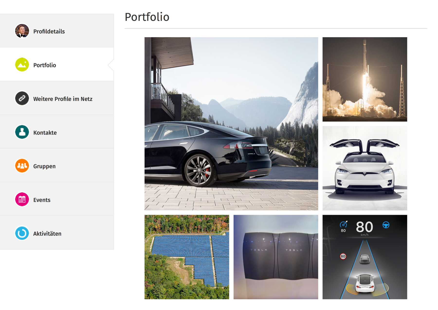
The aim was to build a perfect profile to represent our users as a business professional in a way they wanted to be represented. We achieved this by reformatting the information architecture, creating new features and designing an elegant, beautiful, clean design. The freedom to easily fill and maintain their business identity was the main idea behind this redesign. Users now have the ability to create a rich portfolio presenting their work, portray a positive first impression with quote text and promote their personality with the aggregation of other social networks as well as providing more customizability and personalization to their profile. All-in-all the beautiful and vibrant tabbed navigation gave the finishing touch the profile needed, enabling quick access to relevant information.
There was quite a buzz from blogger's and from news providers both online and offline. On top of that, Weave magazine featured a seven page article on the successful launch of the new XING profile.
My role in this project: Ideation, interaction design, user testing, brainstorming, visual design assistance

Overview of the new profile design (profile details tab).

A little glance behind some of the portfolio tab

Weave magazine (August/September 2013 edition) - featuring 7 page article on the XING profile relaunch.